

The project process & role division between team members is unique to Hack the North and can be confusing. For more details, keep reading!


PREVIEW
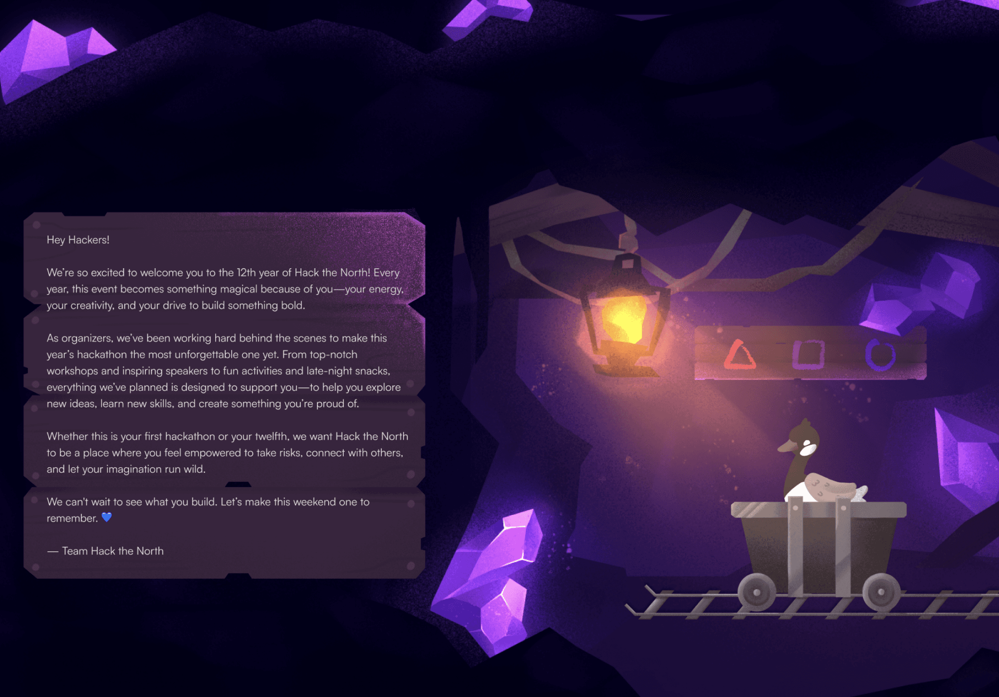
Introducing hackthenorth.com!
The main website for Hack the North 2025.
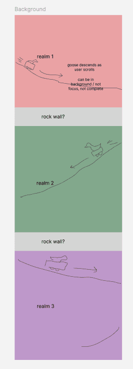
With the visual theme of underground exploration, the 2025 site takes you on a journey with our adventurer goose riding a minecart, traversing through 3 distinct realms.
Featuring animations, horizontal scrolling, and hand-drawn illustrations, Hack the North’s 2025 design team is proud to present our idea of how hackathons can be reimagined.
As of Jan 12, 2026, we’ve had 96k users who visited this version of the site.
CHECK OUT THE SITE
JUMP TO FINAL DESIGN
CONTEXT
What's Hack the North?
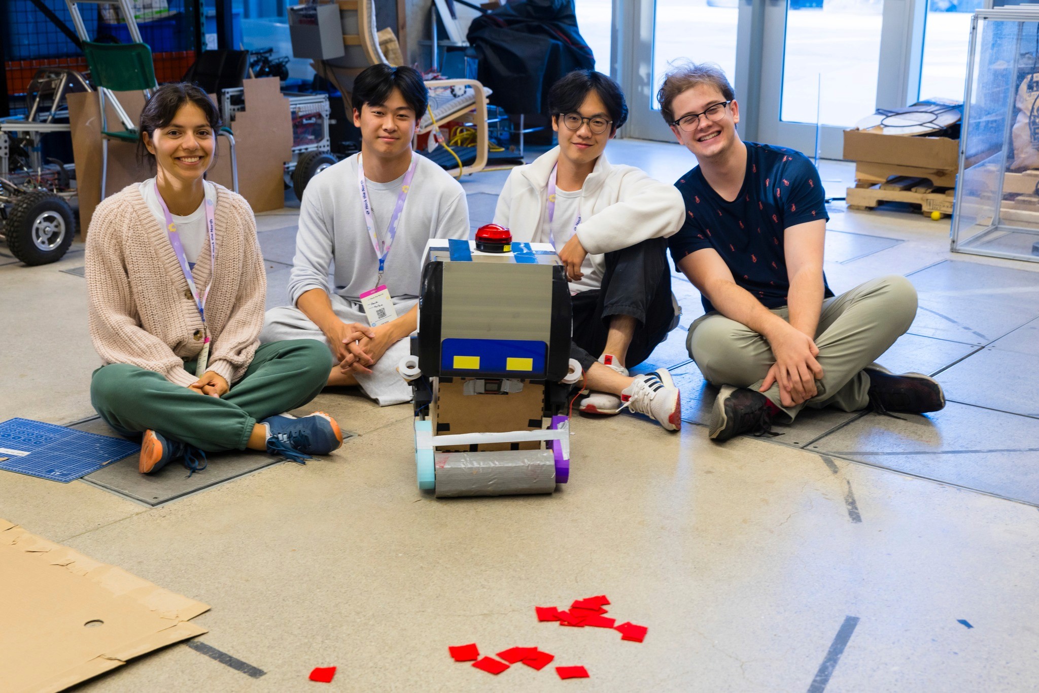
Hack the North is Canada’s biggest hackathon, bringing together 1200+ hackers for 36 hours of building, learning, and community every September. Every year, we help shape the experience—from organizing mentorship, workshops, and events, to making sure attendees feel supported, inspired, and excited to create something meaningful.

ROLE BREAKDOWN & PROJECT TIMELINE
A quick overview on our project structure...
Hack the North refreshes its website and brand every year, and while the process looks linear on paper, it’s actually pretty collaborative and iterative. Since the roles/process can get confusing, here’s a quick breakdown of how things typically run:
The overall project flow
Visual direction & branding
GRAPHIC DESIGNERS
The graphic design team defines the visual theme for the year — colors, illustrations, motifs, and overall vibe. This happens before the website is designed so everything downstream has a strong foundation.
Website experience
PRODUCT DESIGNERS
Using the visual direction as a base, product designers decide how the site should be structured and experienced. This includes:
defining page layouts and content hierarchy (using copy given by the marketing team)
storytelling and interaction ideas
creating prototypes to communicate their vision
Product designers request custom assets from graphic designers, then use them for the high-fidelity mockup.
Building the site
FRONTEND
Designs are handed off to frontend, who then implement the site. Throughout development, product designers stay closely involved to review builds, clarify intent, and iterate as needed.
Team roles at a glance
Design Team
Design Lead
Guide the project timeline
Make final decisions
Give feedback
Graphic Designers (3)
Create visual theme & branding
Create requested website assets
Product Designers (2, including me)
Concept design
Storytelling
Prototyping
Request graphic design assets
Frontend Team
Frontend Lead
Delegate sections to each developer
Manage project timeline
Frontend Developers (6)
Build out the design
Between the two product designers (Olivia & I), we delegated responsibility by splitting the website in half - I was assigned the top half (Hero → Projects & Testimonials) and she was assigned the bottom half (Industry Leaders → Footer).
OUR SCOPE & GOALS
Designing an experience worth exploring
This year, Hack the North's mission statement was to
"Reimagine hackathons & make hackathons fun again."
The design team took that as a challenge. We brainstormed far and wide, including some of the most unrealistic concepts to execute.
We thought: what makes things fun? Exploration. We ultimately landed on the concept of “underground exploration”.
Visual theme: Underground exploration
Following the decision of this concept, the Design Team defined some goals for ourselves:
Goal #1: Excitement —
Make hackers, sponsors, and other attendees excited for Hack the North 2025. We want them to think “This seems like such a cool event. I wanna go!”
Goal #2: Immersion —
Immerse them in the environment. Tell a cohesive story. Focus on the details and the small things. We want them to think “woah”.
And with that, we got to work.
BRANDING PROCESS
The 3 realms
When the Graphic Designers were trying to visualize “underground exploration”, they had trouble landing on one single visual idea. They thought of mystical mushroom caves, lava caves, underground nature biomes, and mineshafts.
But we thought: isn’t the fun part of exploration being able to discover a variety of different things, with each one adding to the excitement?
So rather than stick with one idea we chose to use THREE different realms:
Nature biome
Mystical mushroom cave
Amethyst mine
Was this harder to execute? Yes, for sure. But we were willing to take on the challenge.
With 3 realms, the storytelling aspect naturally unfolded, where we’d take users through different stages and environments while exploring.

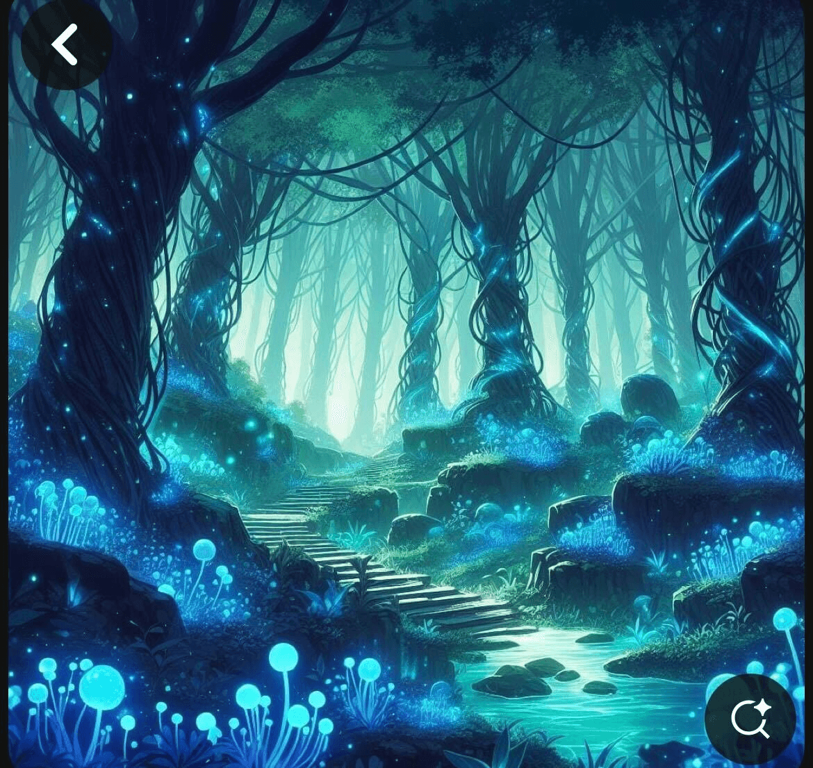
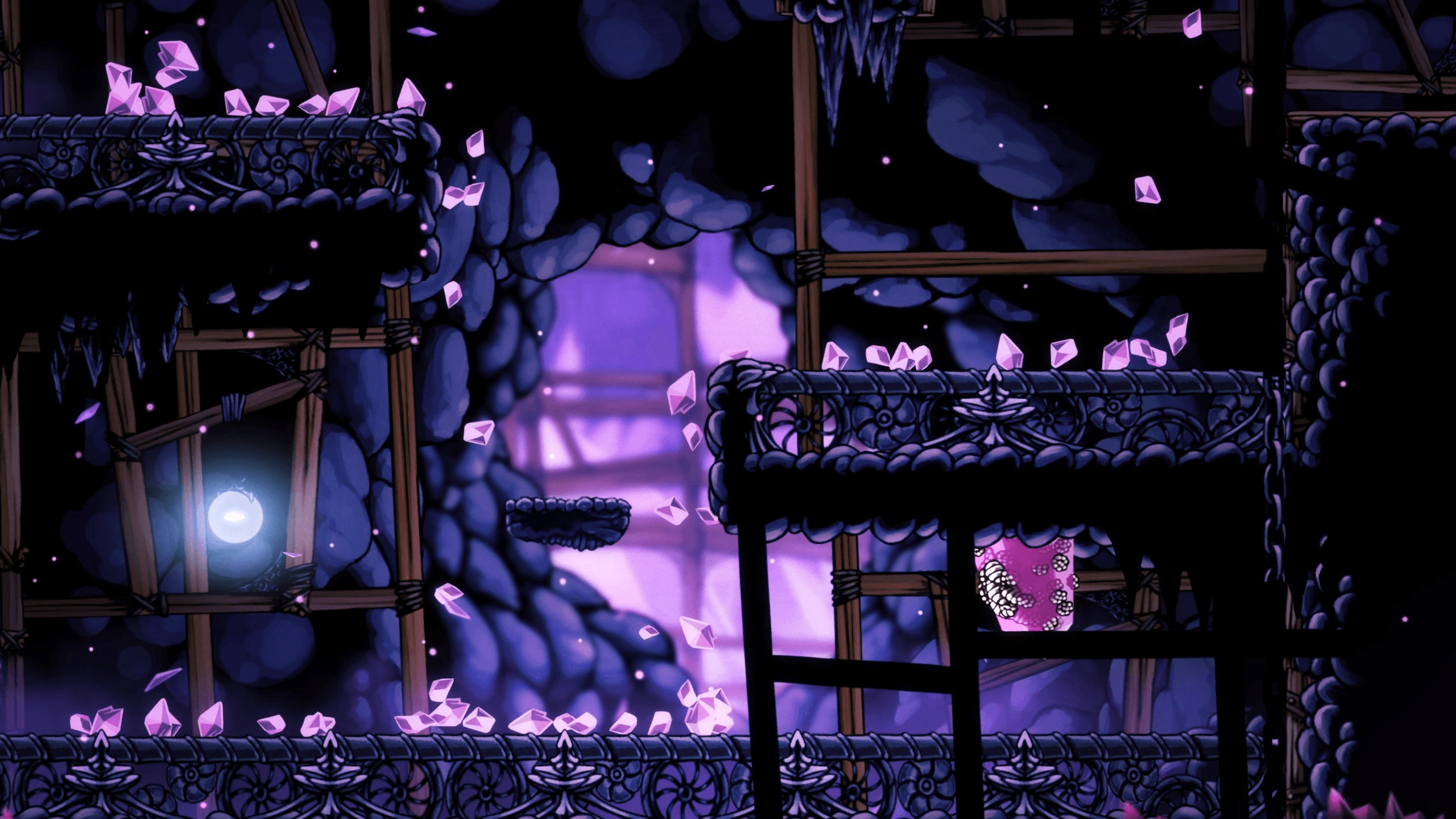
some inspo pics of the realms
IDEATION
Starting big
With this inspiring setup created by the graphic designers, us product designers started with a brainstorm. We allowed ourselves to get carried away by wild ideas, and ride the momentum. Key questions guided our thinking:
How can we build the most immersive environment?
What are some really cool interactive features we could try?
I was in charge of designing the first half of the website (Hero → Projects/Testimonials), and Olivia did the second half (Industry Leaders → Footer). Below are some sneak peeks of my part of our initial brainstorm sesh:

The main ideas from this stage:
Came across parallax effects, fell in love with it, wanted to do it no matter what.
We wanted to incorporate scrolling animations to make it feel more interactive.
Decided the overall “story” of a goose in a minecart exploring underground, passing 3 realms sequentially.
MID-FIDELITY
Nailing down the content
Using ideas and goals from the brainstorm, we all sat down together and nailed down content with the goal of constructing a cohesive story. In this stage, the main question was:
"How can we strike a balance between immersiveness, cohesiveness, cool features, but also realistic executability—while clearly conveying the content?"

The main ideas from this stage:
Visualized the parallax layers
Added a horizontal scroll section 👀
Figured out rough placement of assets & content
Briefly mocked up mobile & ultrawide screens and adjusted planning accordingly
MID-FI PROTOTYPE
Feasibility check?
At this point, we made a quick prototype to visualize the movements of scroll animations and parallax layers - to try and figure out the asset dimensions for when we request them from the graphic designers.
This was before the time of Figma Make (and other AI prototyping tools), so we had to prototype manually.

We showed this prototype to the Frontend Team, and they said it was doable in theory - but it was hard to tell for sure since no one had worked with most of the features we proposed before. We were an ambitious team, so we just went for it.
CHALLENGE
Defining graphic design asset requirements
The transition from lofi to hifi was tough. Us product designers had a vision, but it was difficult to communicate it to our graphic designers, who needed to create our assets - especially given our ambitious ideas. For each asset, it was hard to:
Define the best file format
Define the correct/ideal sizing and resolution
Define the art style
Define any animation behaviours
Especially since we were working with parallax (i.e. many moving layers with different sizes + speeds), the graphic designers had a hard time figuring out what constraints they needed to create the assets with. To make things clearer, I pulled each layer directly from the lofi prototype I made (for accurate sizing) and laid out every piece separately - indicating where assets might need to be cut.
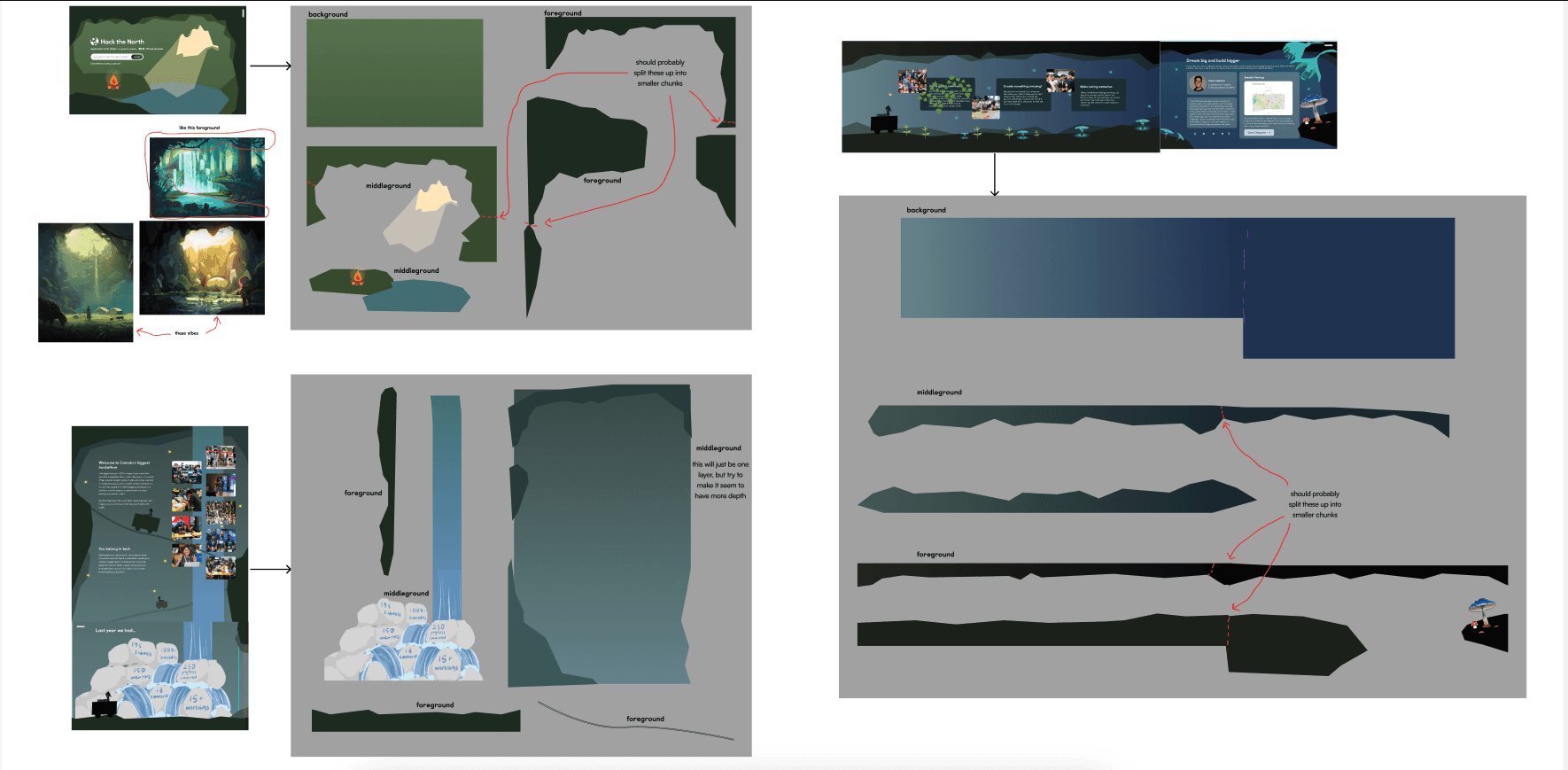
I did my best to clearly define things for the graphic designers, but it was still a shot in the dark - predicting what the frontend team would need. No one really knew what was really required to execute the vision until frontend started coding it. We later ended up having to adjust the layer sizes, but this step was definitely a good place to start.
HI-FI PROTOTYPE
Putting everything together
Once we had the assets from graphic designers, setting up the handoff file involved lots of meticulous effort. On one hand, we had to map out the full journey in a way that shows what each screen should look like when the user scrolls to that section of the page - on the other hand, we had to give frontend the exact graphic assets (and the placement of them). And on top of that, we had to make it make sense for mobile, tablet, and ultrawide screens.
Since we didn’t know which format FE preferred the delivery of assets, I wanted to make it as flexible for them as possible.
So I made two views:
Static Version
Shows what the full site should look like
Annotations explaining every animation and state

Prototyped Version
Shows accurate asset placement
Shows intended parallax movement behaviour
Organized layers for flexible export options


FINAL DESIGN
Jam-packed, immersive, and exciting
Here’s the full list of features in my assigned sections (first half):
Overall, the site features parallax layering and floating firefly animations in every section.
Hero
Startup animation with campfire ignition

About Us
Waterfall animation
Picture fading effect
Goose descending on scroll

Statistics
Glowing stats on hover
Waterfall animation (rocks)

Talking Points
Horizontal scroll

Projects & Testimonials
Glowing flower animation
Typing animation


Super honoured to have so many people who have seen my work :)
AS OF JAN 12, 2026
96.9k people checked it out
REFLECTION
Some final thoughts
It was a wild ride creating this one.
Out of anything I've ever created, this was probably the most unhinged. We sure did reimagine what hackathon websites could be, and I hope people can decipher our goal when creating this site.
This project was FULL of ambitious ideas, which made it a very experimental process—no one knew how to execute anything going into this. As a result, lots of scrappiness, hard work, and sheer willpower.
The only reason why any of this was possible was due to the team's raw passion. I feel both very apologetic and very thankful towards our graphic designers and our frontend team for putting up with my insane ideas, and dedicating so much to making it happen.
PRODUCT THINKING
FULL PLATFORM
WEB APP
IN-DEPTH