


TL;DR
A mobile tabletop trivia game developed by friends, I was asked to aid them with their redesign & brand establishment before showcasing it at Socratica’s W24 Symposium. The booth ended up being a huge success at Symposium, and we were trending on the Trivia charts of the App Store!
OVERVIEW
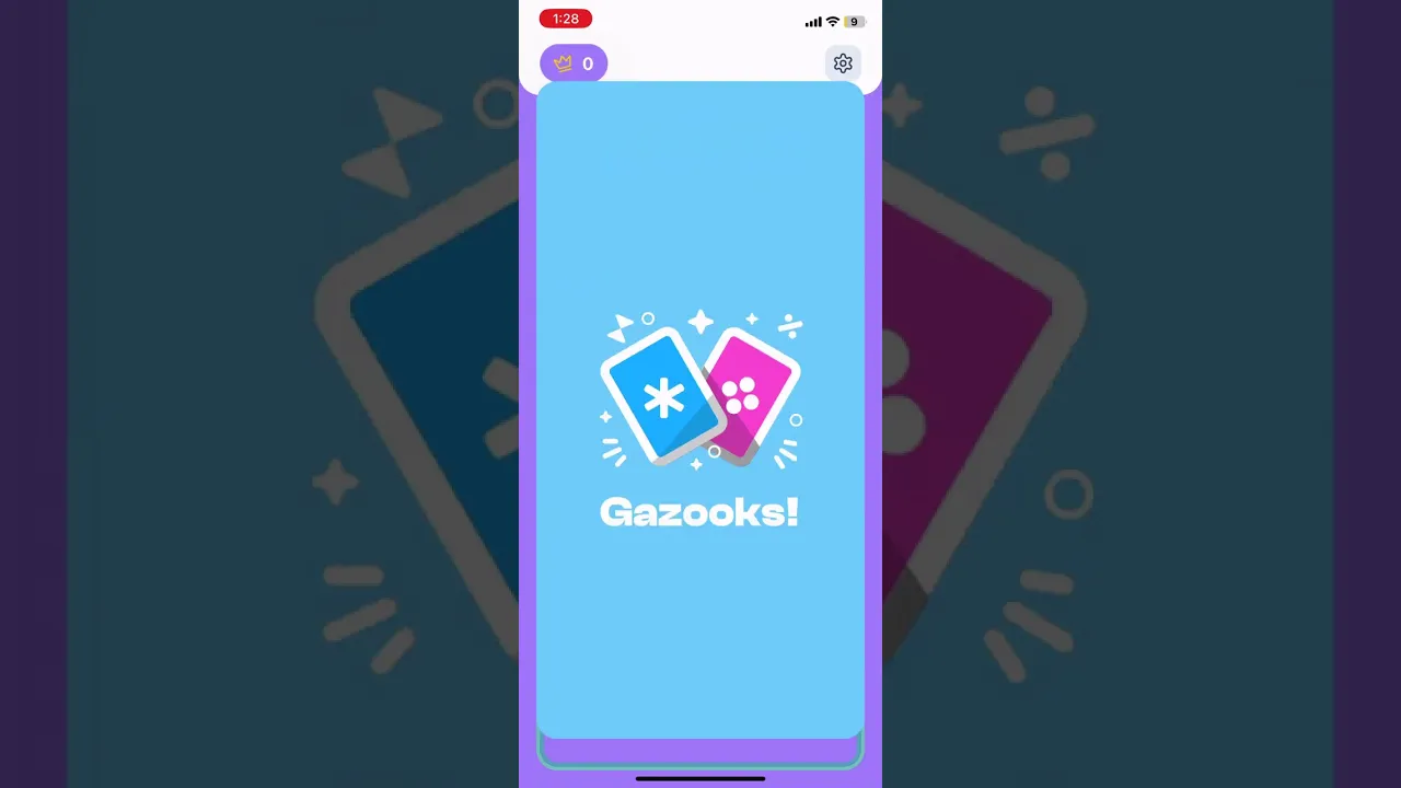
So… What's Gazooks?
Gazooks is a fast-paced, word-association trivia game played on tabletop, in person, with friends.
The rules: Players take turns drawing cards with a symbol and a category. If the symbol on one card matches the symbol on another player's card, the two players are engaged in a duel and they must race to name something in the category on the other player's card! Whoever says a correct answer first wins that duel, and the player who has won the most duels at the end of the game wins.
BRAND
I started with adjectives.
To begin establishing the brand, I started by asking the team what adjectives they would use to describe their game. Since the nature of the game is fast-paced and trivia-based, they came up with the following adjectives:
fun, fast-paced, witty, playful, energetic, exciting, bright, nimble, lively, friendly
BRAND
Modifying symbols
Based on the adjectives, I started by adjusting the colours and shapes of the card symbols. Given that these symbols are the main visual assets of the game, I wanted to set them as the precedent for the rest of the app design. For this game, each symbol being a completely different colour makes the most sense, since we want to maximize the differentiation and recognizability between them. Thus, I didn't come up with completely new colours, but I did adjust them.

Colours (version 1 → version 2)
From version 1 to version 2, I adjusted the colours by decreasing saturation and increasing luminosity. This makes the colours seem brighter and more playful, as they are less harsh on the eyes. Maintaining approximately the same level of saturation across all colours also ensures consistency, which constructs a more cohesive brand.
Shapes (version 2 → final)
From version 2 to the final version, I mainly modified the shape of the symbols by rounding the edges. This makes the symbols friendlier and more playful, since the lines are not as harsh. I also made the line weights of all the symbols consistent, which primarily meant making the snowflake symbol thicker. This also contributes to a more cohesive brand.
BRAND
Determining a colour palette
Finalizing the symbols led directly to the establishment of the colour palette for the rest of the app. Originally, I had the idea of making all the symbol colours equally primary, then selecting less saturated versions as background colours, to make it less overwhelming when used as a background. I envisioned all primary colours to be used equally to maximize the playfulness of the brand.

However, for simplicity, we ended up selecting purple as our primary colour, with the rest being secondary. Light purple, being a colour that does not appear often in nature, symbolizes ambition and creativity, thus being a suitable colour to establish the competitive trivia space of Gazooks. It also serves as a neutral base colour not pertaining to any specific topic or category.
Note: we chose to keep our app in "light mode" with an off-white (#FBFBFB) as the background, since this more accurately portrays "bright" and "lively" compared to a dark background.
Finally, we arrive at the following colour hierarchy for Gazooks:

BRAND
Redesigning the logo
Upon laying down the foundation for the brand, it was time to approach the logo. To start, I analyzed the old logo, to pinpoint more specifically which aspects needed improvement.
Missing identifying symbols, characters, and/or imagery
Using undefined/random colours
Overall ambiguous brand identity; does not clearly indicate Gazooks
Ideation
I felt that the easiest place to start was to determine a main image, then build off of it. I thought about using an hourglass, a star, or a timer, since these all encapsulate Gazooks' brand adjectives. However, I ended up deciding to keep the card imagery, since I feel that it still most straightforwardly represents Gazooks. In addition, due to time constraints, I did not have the bandwidth to more freely explore other possible options.
However, I noticed that the cards in the old logo felt too complex, and I wanted to simplify the imagery to it's easier to digest. I ended up using two cards, arranged further apart so it felt a bit more dynamic. I wanted to highlight the card symbols as the identifying imagery, so I embedded the cards with the symbols and added a patterned background of symbols that included every type. All of these decisions, including their arrangement and sizing, were made based on the brand adjectives defined above.
Below are some of the variations I came up with:

With extensive discussion with the team, we ended up selecting the following logo:
Colours: Circle Purple (primary), Dots Pink & Snowflake Blue (secondary); this analogous colour scheme enhances cohesiveness.
Primary image: iconographic version of Gazooks' playing cards; easily identifiable as Gazooks.
Surrounding symbols: stars and symbols, like particles enhancing the main image, portray its liveliness and excitement.
RESEARCH & ANALYSIS
Testing & analyzing the original design
In order to pinpoint the issues with the original design, we had around 6 different groups of people play the game and voice their feedback on any issues they encountered. Although the data collection process was more informal, we were able to consolidate some valuable feedback and translate them into actionable improvements. These were some of the pain points our users experienced:

While the red sticky notes refer to issues pertaining to in-game screens, the other colours refer to other screens or aspects of the app. Evidently, the users experienced the most pain points with the in-game screen, notably:
Unintuitive duel-winning function
Missing settings menu
Unintuitive card drawing
Redundant or confusing UI elements
For reference, this is what the original screens looked like:

Based on our research, I came up with the following "How might we" statements to define the course of the redesign:
How might we…
Make duel-winning more intuitive and straightforward?
Rearrange the in-game UI bar to properly prioritize elements and information?
Design a turn indicator that feels simple yet intuitive?
Design a tutorial that is simpler, easier to understand and visualize?
Create a lobby interface that replicates real tabletop setting while making it simple yet intuitive?
Integrate our brand guidelines into each screen while balancing our other goals?
IDEATION & ITERATION
Re-defining user flows?
Since the overall user flow for this app is relatively straightforward, we did not make any changes to the original flow. Thus, we targeted the redesign using the same flow as before; the green squares represent screens and the blue circles represent user actions.

Since we were limited with time, we did not create any ideation sketches or brainstorms. However, I applied the brand guidelines and addressed the pain points as best as I could, ending up with several iterations and variations for many of the screens, each exploring and prioritizing different aspects of the user experience. Below are some of the examples:
Home Screen
The home screen variations were mostly the result of experimenting with the proposed colour palette before the brand was finalized. They all follow the general format of title > logo > buttons, so that we could strengthen the brand presence in the home screen.

Select Deck
The variations for the deck selection screen include using squares with icons as decks, cycling through each deck with arrow keys, and showing each deck more visually as a stack of cards. I played around with the patterning and icons for the deck backgrounds.

In-Game Screen
I started the in-game screen variations by plotting down a proposed UI that prioritized wins front and centre, for maximum visibility during gameplay. I experimented with which elements to include in the UI bar(s), and created a more visual representation of the stack.

Learn-to-play
For the tutorial I started by proposing the simplest idea of writing a list in steps, followed by a more visual representation using 4 mobile devices. Upon noticing that 3 devices fit much more nicely on a phone screen, I adjusted the visual version to six total devices.

Final designs
Our final design is demoed below. Note that in the video demo, other devices are joining and playing the game in the background.
Create Game Flow and In-Game Playing
Learn-to-Play Flow
The learn-to-play tutorial was redesigned to be more visual based, less text-heavy, and guided the user through a mock game for easier understanding of the game rules.

Summary of Features and Improvements

NEXT STEPS
What still needs to be done?
Podium redesign —
One of the screens still awaiting redesign is the podium/leaderboard screen after a game finishes. Next steps would ideally include a graphical representation of the top 3 players in that game.
More decks and custom deck creation —
One of the features that the devs would like to implement would be allowing the user to create their own decks to play. This would involve potentially designing a deck creation screen where players can edit their decks.
More user testing and analytics tracking —
Going forward, we'd like to gather more research by tracking user data such as: time spent on each deck/card, time spent on each screen, etc. This would help further balance the game and make it even more intuitive.
KEY TAKEAWAYS
In hindsight…
Interactivity in game design —
This was the first time I've designed interactivity in a game setting, and I've noticed that there are different considerations in this context compared to a more professional, functional setting such as a financial planning app. Game design focuses much more on enjoyability and intuitiveness of functions and features, and it's much more important to prioritize how any action feels and responds to the user.
Limited developer resources —
Working directly with the developers to discuss design ideas, I've had my fair share of ideas turned down due to feasibility concerns. Especially since we worked in a limited time frame, we had to ensure ideas could be implemented. In fact, several of the screens were designed on-the-fly, without even a layout (or much less a prototype) in Figma to demonstrate. Thus, I've realized the importance of recognizing a balance between efficiency and creativity.
PRODUCT THINKING
FULL PLATFORM
WEB APP
IN-DEPTH