Made over sleepless nights powered by coffee. © Weinna Zheng 2026
Made over sleepless nights powered by coffee.
© Weinna Zheng 2025
PRODUCT THINKING
PRODUCT THINKING
PRODUCT THINKING
FULL PLATFORM
FULL PLATFORM
FULL PLATFORM
WEB APP
WEB APP
WEB APP
IN-DEPTH
IN-DEPTH
IN-DEPTH
Facilitating absence management for music teachers & administrators
Facilitating absence management for music teachers & administrators
Facilitating absence management for music teachers & administrators
through Sistema Tacet, an absence reporting platform.
through Sistema Tacet, an absence reporting platform.
through Sistema Tacet, an absence reporting platform.


X
X
Timeline
Timeline
12 Months
May 2024 - April 2025
12 Months
May 2024 - April 2025
12 Months
May 2024 - April 2025
Role
Role
Product Designer
Product Designer
Team
Team
2 Product Managers
2 Product Designers
8 Software Developers
2 Product Managers
2 Product Designers
8 Software Developers
Responsibilities
Responsibilities
Absence Events
Admin Dashboard
Design System
Absence Events
Admin Dashboard
Design System

This is a Blueprint project! UW Blueprint is a team of passionate students at UWaterloo who partner with non-profits to build tech for social good. For this project, we (Blueprint) partnered with Sistema Toronto, and we allocated a team of 13 students to build out this project.
This is a Blueprint project! UW Blueprint is a team of passionate students at UWaterloo who partner with non-profits to build tech for social good. For this project, we (Blueprint) partnered with Sistema Toronto, and we allocated a team of 13 students to build out this project.
This is a Blueprint project! UW Blueprint is a team of passionate students at UWaterloo who partner with non-profits to build tech for social good. For this project, we (Blueprint) partnered with Sistema Toronto, and we allocated a team of 13 students to build out this project.
Introducing Sistema Tacet—
an absence management platform for music teachers, used in conjunction with an administrator dashboard.


WHAT’S SISTEMA?
WHAT’S SISTEMA?
A non-profit empowering music-driven kids.
A non-profit empowering music-driven kids.
Sistema Toronto, a non-profit organization established in Toronto, Canada, is dedicated to providing accessible and high-quality music education to children and youth from underserved communities.
Sistema Toronto, a non-profit organization established in Toronto, Canada, is dedicated to providing accessible and high-quality music education to children and youth from underserved communities.
THE PROBLEM
THE PROBLEM
Finding substitutes is a tedious process.
Finding substitutes is a tedious process.
Sistema faces a challenge in efficiently tracking teacher absences and finding substitutes. Before, the org relied on a manual process involving Google Forms for logging teacher absences, and admins having to manually add these absences to the calendar.
Sistema faces a challenge in efficiently tracking teacher absences and finding substitutes. Before, the org relied on a manual process involving Google Forms for logging teacher absences, and admins having to manually add these absences to the calendar.
THE SOLUTION
THE SOLUTION
An absence management platform for music teachers.
An absence management platform for music teachers.
So we created Sistema Tacet, a platform where teachers can declare their own absences, as well as substitute for their peers. With easy calendar navigation and filters resembling the oh-so-familiar Google Calendar, teachers and admins now have a way to efficiently handle any absence that comes their way.
So we created Sistema Tacet, a platform where teachers can declare their own absences, as well as substitute for their peers. With easy calendar navigation and filters resembling the oh-so-familiar Google Calendar, teachers and admins now have a way to efficiently handle any absence that comes their way.
Sistema Tacet Walkthrough for Teachers
Sistema Tacet Walkthrough for Teachers
Phase 1: Define
Phase 1: Define
THE CHALLENGE AT A GLANCE
THE CHALLENGE AT A GLANCE
Managing absences at Sistema was manual and inefficient.
Teachers relied on emailing admins to report absences.
Admins then had to track changes in Google Calendar, find subs, and keep everything updated — across 5+ locations.
This worked for one absence. But at scale? Chaos.
Teachers relied on emailing admins to report absences.
Admins then had to track changes in Google Calendar, find subs, and keep everything updated — across 5+ locations.
This worked for one absence. But at scale? Chaos.

Two user groups, different needs
Two user groups, different needs
Teachers need to:
log absences
attach lesson plans
claim available classes
get reminders + change alerts
Admins need to:
edit any absence
monitor absences across locations
manage users / roles
manage subjects & locations
export to Google Calendar
OUR SCOPE
OUR SCOPE
Where were our heads at?
Where were our heads at?
Some things we wanted to prioritize throughout this project:
Familiarity —
built around Google Calendar
Self-sufficiency —
minimal support post-handoff
Customization —
tailored to Sistema’s workflows
“Why couldn’t you just make a Google Calendar extension...?”
Sistema wanted full customizability and self-sufficiency. After some analysis, it was much easier to create our system from scratch than to try and adapt to Google Calendar’s existing infrastructure. We wanted Sistema to have an entire customized platform for themselves —that’s one of the privileges of being volunteers working with non-profits.
Phase 2: Design
Phase 2: Design
PLATFORM DESIGN
PLATFORM DESIGN
Structuring for simplicity —and flexibility.
Structuring for simplicity —and flexibility.
We designed two distinct experiences: one for teachers, one for admins.
Both use the same calendar foundation, but with different levels of control.
We designed two distinct experiences: one for teachers, one for admins.
Both use the same calendar foundation, but with different levels of control.

For teachers
A single calendar where teachers can:
Log and edit their own absences
Attach lesson plans
View and claim absences posted by others
Simple, streamlined, and focused on the teacher.

For admins
Admins are teachers too—but need more control.
We gave them access to:
Manage all absences (any user, any class)
Attach plans on behalf of others
View metrics, manage users, edit class structures
Modify subjects, locations, and email subs
Multiple touchpoints, full visibility, long-term self-sufficiency.
Why this matters
We built off what teachers were already familiar with (Google Calendar), but added just enough structure for admins to oversee the whole system—without introducing unnecessary friction.
Starting with our primary user: The Teacher.
HOW DID WE START?
HOW DID WE START?
Repurposing what worked
Repurposing what worked
We began with what Sistema already knew— Google Calendar.
Rather than reinvent, we mapped how their current process worked and adjusted it for their needs.
We began with what Sistema already knew— Google Calendar.
Rather than reinvent, we mapped how their current process worked and adjusted it for their needs.

My Google Calendar
My Google Calendar

Sistema’s Google Calendar (admin)
Sistema’s Google Calendar (admin)
Some examples...

Fun fact: we didn’t end up moving forward with the first one (only show applicable days) since we wanted our platform to support Sistema even in the case where they started to hold classes on other days of the week (i.e. we chose self-sufficiency over customizability in this case). Sometimes we needed to prioritize things even among the goals we set ourselves, based on what was more realistic.
The point here is that we used features from Google Calendar to guide our thinking, then we made decisions from there.
Key questions guided our thinking:
What does Google Calendar offer that we don’t need?
What can we adapt to better support absence tracking?
This framework shaped every customization decision, grounding each one in a clear rationale.
(of course, we also took a peek at a bunch of other references to see what was a standard across calendar apps (see below), but mainly focused on Google Calendar when repurposing features for Sistema.)

Apple calendar

Notion calendar


Misc calendar concepts on Dribbble
SKETCHES AND WIREFRAMES
Mapping the vision
We sketched out early structures and interface flows together as a team -- both PMs and designers.


To make sure we weren’t too quick to jump straight into the GCal layout, we used our wireframes to do a quick sanity check through usability tests.
USABILITY TESTING
Was the Google Calendar layout the right call?
Using our interactive lo-fi prototype, we conducted some quick tests with 5 users (3 of our devs, 2 misc students), just to ensure the GCal features actually work well for our intended purpose. Tasks included:
Declaring and filling an absence
Using filters
Navigating modal states
80% successfully completed the tasks. Overall, our users enjoyed the familiarity of Google Calendar ✅

Some affinity mapping helped us extract some good feedback, which led to improvements in button placements, upload flows, and copy.
DESIGN CHOICE: CALENDAR TYPE
Choosing a layout that balanced clarity, scalability, and backend simplicity.
Since our platform was centred around a calendar view, we explored multiple different layout options:
Fixed with left/right arrows
✅ Familiar to GCal users
✅ Easy to fit entire month in one view
❌ Fixed calendar date sizes → limited number of events displayed per day
Infinite vertical scroll
✅ Dynamically fits all absences, scalable
❌ Hard to jump far into the future
❌ Heavier backend load
Vertical scroll per month + arrows [Chosen]
✅ Dynamically fits all absences
✅ Easier to load in the backend
❌ Hard to jump far into the future


We ultimately chose vertical scroll per month + arrows. It provided just enough flexibility to view long-term patterns while keeping the UI light and navigable for both teachers and admins.
Why no daily/weekly views like Google Calendar does?
Sistema requested we omit time-specific views altogether.
Classes happen at the same time each day
Only one class per room per day → So we didn’t need time blocks or granular views. A monthly absence overview was more than sufficient.
This was another decision guided by our goal of customizability.
CHALLENGE
Defining Absence Modal States
Absence events function similarly to Google Calendar events, appearing as widgets within a calendar.
Clicking on one opens a modal containing key information—but the content varies depending on:
who the absence belongs to
who’s viewing it
whether it’s been filled
One big challenge I came across was defining which states needed to be defined, and how to design the differences between states.
As part of our goals, we wanted to customize the experience specifically for Sistema, which meant personalizing the experience for every relevant state.

What are all the different cases?
Each absence can be:
Filled (by who?) or Unfilled
Belonging to the User or another user
Perspective of the User or another user
This creates multiple permutations, each needing its own layout logic.
Filled/Unfilled
Filled/Unfilled
Belonging to
Belonging to
Perspective of
Perspective of
Unfilled
Unfilled
User
User
User
User
Unfilled
Unfilled
User
User
Other
Other
Unfilled
Unfilled
Other
Other
User
User
Filled by Other
Filled by Other
User
User
User
User
Filled by Filler
Filled by Filler
User
User
Other
Other
Filled by Other
Filled by Other
User
User
Other
Other
Filled by Filler
Filled by Filler
Other
Other
User
User
Filled by Other
Filled by Other
Other
Other
User
User
Filled by Filler
Filled by Filler
Other
Other
Other
Other
Filled by Other
Filled by Other
Other
Other
Other
Other
^ full list omitted for brevity.
^ full list omitted for brevity.
For each permutation, we needed to consider:
Visibility: Who should this be visible to?
This helped us eliminate some permutations where it was redundant to show certain users.
Editability: Who can modify the data, and how should the design reflect that?
This way of thinking led us to introduce consistent labels like “Filled by [user]” and visibility tags like “Only visible to [filler] and [declarer]”.
One notable decision was to label [Unfilled, Belonging to User, Perspective of User] as “Unfilled” while labelling [Unfilled, Belonging to Other, Perspective of User] as “Open to fill”—This was to customize the experience for different perspectives.
The rationale is that users want their own absences to be filled, hence why an “unfilled” state is unfavourable. But as someone browsing to fill someone else’s absence, an unfilled absence acts as an open invitation.
Handling optional states and special cases
We also accounted for optional fields and special cases that could subtly influence UI layout.

Each of these look different depending on the perspective, which ended up creating new states as well.

In the end, we defined 14 distinct modal states for our final designs. The orange notes indicate the notable changes based on the impacting factors.

Curious why this is categorized using “My Declared & Filled Absences” and “Explore Fillable Absences”?
Read the next section to find out why!
USER FEEDBACK → DESIGN DECISION
Accommodating our calendar for user intentions
In user testing, we noticed a recurring problem: teachers were confused by the many different widget states in the calendar. The variety of scenarios—claimed vs unclaimed, user vs others, filled vs unfilled—was overwhelming and difficult to interpret at a glance.
(For reference, by widgets I’m referring to these; the mini versions of the modals in the prev section. Check out all of our widget states we had from an earlier iteration—it’s a lot, right? Wait till you see all of them combined in the same calendar later.)

So we stepped back to reframe the design around user intent.
Instead of showing everything at once, we asked:
What are the two main reasons a teacher uses the calendar?
We found that they usually came with one of two goals:
1
Explore fillable absences—
“Can I help another teacher today?”
2
Monitor my own absences—
“Has someone filled in for me yet?”
Solution: Two Distinct Views
To reduce cognitive load, we split the calendar into two dedicated tabs:
Explore Fillable Absences:
For browsing and picking up others’ shifts.
My Declared & Filled Absences
For keeping track of your own events.
This separation aligned with real user tasks and allowed each view to be simpler, clearer, and more focused. And as a result, we updated the widget styles to make it easier to intuitively understand the states, with the additional context from the tabs.
❌ Old calendar view (overwhelming!)

✅ New calendar views, separated by tabs & updated widgets


Why did we choose to separate into tabs instead of just adding extra filters on the left?
Filters can be left on by accident, or multiple filters can be applied at once—leading users to think something’s missing or broken. By contrast, tabs force a singular, focused mode and guide users more intuitively through the base structure of the platform.
Final Designs - Teacher View
Final Designs - Teacher View
STRUCTURE
Easily navigate the calendar

CALENDAR VIEW
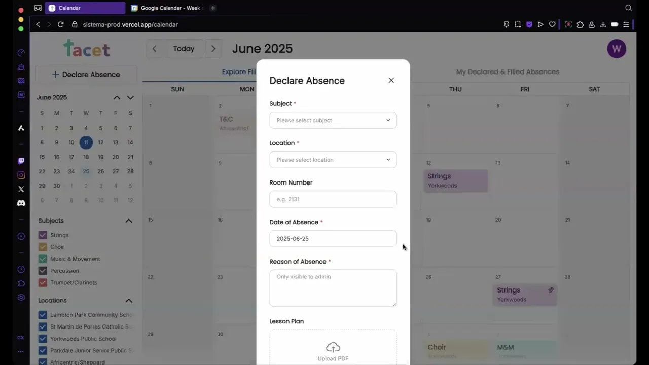
Fill and Declare Absences

CORE FEATURES
Filters and User Profile

In addition, check out the admin view designs below!
If you want to learn more about the process for admin view, feel free to reach out.
Final Designs - Admin View
Final Designs - Admin View
CALENDAR VIEW
Create, edit, & delete any absence

ADMIN DASHBOARD
Monitor stats and insights
Manage your teachers and other admins

ADMIN DASH → SYSTEM SETTINGS
Customize subjects & locations

Have more lingering questions about this project? Just ask!
Send over an email or msg me on Linkedin :)
PRODUCT THINKING
FULL PLATFORM
WEB APP
IN-DEPTH
Facilitating absence management for music teachers & administrators
through Sistema Tacet, an absence reporting platform.
X
Timeline
12 Months
May 2024 - April 2025
Role
Product Designer
Team
2 Product Managers
2 Product Designers
8 Software Developers
Responsibilities
Absence Events
Admin Dashboard
Design System
This is a Blueprint project! UW Blueprint is a team of passionate students at UWaterloo who partner with non-profits to build tech for social good. For this project, we (Blueprint) partnered with Sistema Toronto, and we allocated a team of 13 students to build out this project.
Introducing Sistema Tacet—
an absence management platform for music teachers, used in conjunction with an administrator dashboard.
WHAT’S SISTEMA?
A non-profit empowering music-driven kids.
Sistema Toronto, a non-profit organization established in Toronto, Canada, is dedicated to providing accessible and high-quality music education to children and youth from underserved communities.
THE PROBLEM
Finding substitutes is a tedious process.
Sistema faces a challenge in efficiently tracking teacher absences and finding substitutes. Before, the org relied on a manual process involving Google Forms for logging teacher absences, and admins having to manually add these absences to the calendar.
THE SOLUTION
An absence management platform for music teachers.
So we created Sistema Tacet, a platform where teachers can declare their own absences, as well as substitute for their peers. With easy calendar navigation and filters resembling the oh-so-familiar Google Calendar, teachers and admins now have a way to efficiently handle any absence that comes their way.
Sistema Tacet Walkthrough for Teachers
Phase 1: Define
THE CHALLENGE AT A GLANCE
Managing absences at Sistema was manual and inefficient.
Teachers relied on emailing admins to report absences.
Admins then had to track changes in Google Calendar, find subs, and keep everything updated — across 5+ locations.
This worked for one absence. But at scale? Chaos.
Two user groups, different needs
Teachers need to:
log absences
attach lesson plans
claim available classes
get reminders + change alerts
Admins need to:
edit any absence
monitor absences across locations
manage users / roles
manage subjects & locations
export to Google Calendar
OUR SCOPE
Where were our heads at?
Some things we wanted to prioritize throughout this project:
Familiarity —
built around Google Calendar
Self-sufficiency —
minimal support post-handoff
Customization —
tailored to Sistema’s workflows
“Why couldn’t you just make a Google Calendar extension...?”
Sistema wanted full customizability and self-sufficiency. After some analysis, it was much easier to create our system from scratch than to try and adapt to Google Calendar’s existing infrastructure. We wanted Sistema to have an entire customized platform for themselves —that’s one of the privileges of being volunteers working with non-profits.
Phase 2: Design
PLATFORM DESIGN
Structuring for simplicity —and flexibility.
We designed two distinct experiences: one for teachers, one for admins.
Both use the same calendar foundation, but with different levels of control.
For teachers
A single calendar where teachers can:
Log and edit their own absences
Attach lesson plans
View and claim absences posted by others
Simple, streamlined, and focused on the teacher.
For admins
Admins are teachers too—but need more control.
We gave them access to:
Manage all absences (any user, any class)
Attach plans on behalf of others
View metrics, manage users, edit class structures
Modify subjects, locations, and email subs
Multiple touchpoints, full visibility, long-term self-sufficiency.
Why this matters
We built off what teachers were already familiar with (Google Calendar), but added just enough structure for admins to oversee the whole system—without introducing unnecessary friction.
Starting with our primary user: The Teacher.
HOW DID WE START?
Repurposing what worked
We began with what Sistema already knew— Google Calendar.
Rather than reinvent, we mapped how their current process worked and adjusted it for their needs.
My Google Calendar
Sistema’s Google Calendar (admin)
Some examples...
Fun fact: we didn’t end up moving forward with the first one (only show applicable days) since we wanted our platform to support Sistema even in the case where they started to hold classes on other days of the week (i.e. we chose self-sufficiency over customizability in this case). Sometimes we needed to prioritize things even among the goals we set ourselves, based on what was more realistic.
The point here is that we used features from Google Calendar to guide our thinking, then we made decisions from there.
Key questions guided our thinking:
What does Google Calendar offer that we don’t need?
What can we adapt to better support absence tracking?
This framework shaped every customization decision, grounding each one in a clear rationale.
(of course, we also took a peek at a bunch of other references to see what was a standard across calendar apps (see below), but mainly focused on Google Calendar when repurposing features for Sistema.)
Apple calendar
Notion calendar
Misc calendar concepts on Dribbble
SKETCHES AND WIREFRAMES
Mapping the vision
We sketched out early structures and interface flows together as a team -- both PMs and designers.
To make sure we weren’t too quick to jump straight into the GCal layout, we used our wireframes to do a quick sanity check through usability tests.
USABILITY TESTING
Was the Google Calendar layout the right call?
Using our interactive lo-fi prototype, we conducted some quick tests with 5 users (3 of our devs, 2 misc students), just to ensure the GCal features actually work well for our intended purpose. Tasks included:
Declaring and filling an absence
Using filters
Navigating modal states
80% successfully completed the tasks. Overall, our users enjoyed the familiarity of Google Calendar ✅
Some affinity mapping helped us extract some good feedback, which led to improvements in button placements, upload flows, and copy.
DESIGN CHOICE: CALENDAR TYPE
Choosing a layout that balanced clarity, scalability, and backend simplicity.
Since our platform was centred around a calendar view, we explored multiple different layout options:
Fixed with left/right arrows
✅ Familiar to GCal users
✅ Easy to fit entire month in one view
❌ Fixed calendar date sizes → limited number of events displayed per day
Infinite vertical scroll
✅ Dynamically fits all absences, scalable
❌ Hard to jump far into the future
❌ Heavier backend load
Vertical scroll per month + arrows [Chosen]
✅ Dynamically fits all absences
✅ Easier to load in the backend
❌ Hard to jump far into the future
We ultimately chose vertical scroll per month + arrows. It provided just enough flexibility to view long-term patterns while keeping the UI light and navigable for both teachers and admins.
Why no daily/weekly views like Google Calendar does?
Sistema requested we omit time-specific views altogether.
Classes happen at the same time each day
Only one class per room per day → So we didn’t need time blocks or granular views. A monthly absence overview was more than sufficient.
This was another decision guided by our goal of customizability.
CHALLENGE
Defining Absence Modal States
Absence events function similarly to Google Calendar events, appearing as widgets within a calendar.
Clicking on one opens a modal containing key information—but the content varies depending on:
who the absence belongs to
who’s viewing it
whether it’s been filled
One big challenge I came across was defining which states needed to be defined, and how to design the differences between states.
As part of our goals, we wanted to customize the experience specifically for Sistema, which meant personalizing the experience for every relevant state.
What are all the different cases?
Each absence can be:
Filled (by who?) or Unfilled
Belonging to the User or another user
Perspective of the User or another user
This creates multiple permutations, each needing its own layout logic.
Filled/Unfilled
Belonging to
Perspective of
Unfilled
User
User
Unfilled
User
Other
Unfilled
Other
User
Filled by Other
User
User
Filled by Filler
User
Other
Filled by Other
User
Other
Filled by Filler
Other
User
Filled by Other
Other
User
Filled by Filler
Other
Other
Filled by Other
Other
Other
^ full list omitted for brevity.
For each permutation, we needed to consider:
Visibility: Who should this be visible to?
This helped us eliminate some permutations where it was redundant to show certain users.
Editability: Who can modify the data, and how should the design reflect that?
This way of thinking led us to introduce consistent labels like “Filled by [user]” and visibility tags like “Only visible to [filler] and [declarer]”.
One notable decision was to label [Unfilled, Belonging to User, Perspective of User] as “Unfilled” while labelling [Unfilled, Belonging to Other, Perspective of User] as “Open to fill”—This was to customize the experience for different perspectives.
The rationale is that users want their own absences to be filled, hence why an “unfilled” state is unfavourable. But as someone browsing to fill someone else’s absence, an unfilled absence acts as an open invitation.
Handling optional states and special cases
We also accounted for optional fields and special cases that could subtly influence UI layout.
Each of these look different depending on the perspective, which ended up creating new states as well.
In the end, we defined 14 distinct modal states for our final designs. The orange notes indicate the notable changes based on the impacting factors.
Curious why this is categorized using “My Declared & Filled Absences” and “Explore Fillable Absences”?
Read the next section to find out why!
USER FEEDBACK → DESIGN DECISION
Accommodating our calendar for user intentions
In user testing, we noticed a recurring problem: teachers were confused by the many different widget states in the calendar. The variety of scenarios—claimed vs unclaimed, user vs others, filled vs unfilled—was overwhelming and difficult to interpret at a glance.
(For reference, by widgets I’m referring to these; the mini versions of the modals in the prev section. Check out all of our widget states we had from an earlier iteration—it’s a lot, right? Wait till you see all of them combined in the same calendar later.)
So we stepped back to reframe the design around user intent.
Instead of showing everything at once, we asked:
What are the two main reasons a teacher uses the calendar?
We found that they usually came with one of two goals:
1
Explore fillable absences—
“Can I help another teacher today?”
2
Monitor my own absences—
“Has someone filled in for me yet?”
Solution: Two Distinct Views
To reduce cognitive load, we split the calendar into two dedicated tabs:
Explore Fillable Absences:
For browsing and picking up others’ shifts.
My Declared & Filled Absences
For keeping track of your own events.
This separation aligned with real user tasks and allowed each view to be simpler, clearer, and more focused. And as a result, we updated the widget styles to make it easier to intuitively understand the states, with the additional context from the tabs.
❌ Old calendar view (overwhelming!)
✅ New calendar views, separated by tabs & updated widgets
Why did we choose to separate into tabs instead of just adding extra filters on the left?
Filters can be left on by accident, or multiple filters can be applied at once—leading users to think something’s missing or broken. By contrast, tabs force a singular, focused mode and guide users more intuitively through the base structure of the platform.
Final Designs - Teacher View
STRUCTURE
Easily navigate the calendar
CALENDAR VIEW
Fill and Declare Absences
CORE FEATURES
Filters and User Profile
In addition, check out the admin view designs below!
If you want to learn more about the process for admin view, feel free to reach out.
Final Designs - Admin View
CALENDAR VIEW
Create, edit, & delete any absence
ADMIN DASHBOARD
Monitor stats and insights
Manage your teachers and other admins
ADMIN DASH → SYSTEM SETTINGS
Customize subjects & locations
Have more lingering questions about this project? Just ask!
Send over an email or msg me on Linkedin :)
PRODUCT THINKING
FULL PLATFORM
WEB APP
IN-DEPTH