Problem Space
Existing food delivery services rarely cater to the more unique needs of elderly users, despite a very prevalent demand for older people who have more trouble preparing food for themselves and their families.
Our solution
Senior Savory is a food delivery platform for the elderly, addressing dietary, health, mobility, and visual/hearing concerns.
Click to Jump
Design Process
To gain a deeper understanding of the specific needs and challenges faced by our target user group, individuals aged 60 and above, we conducted four interviews with seniors. The primary goal was to uncover insights into their daily meal preparation routines, their digital literacy, and their experiences with food delivery services.
The following questions guided our discussions:
- Who makes your meals on a daily basis? Do you have a caretaker?
- Is there anything you have trouble with on a daily basis? (such as seeing, hearing, walking, etc.)
- What kinds of foods do you like to eat?
- How often do you eat in a day? How big is each meal?
- What would facilitate your meal-making process?
- How familiar are you with technology? What technologies have you interacted with before or on a daily basis?
- Have you ordered delivery food before? What was difficult about the process?
- How familiar are you with mobile apps? How frequently do you use them? If so, have you ever used a food delivery app?
- Any difficulties with using a mobile app / food delivery app?
Based on the insights gathered from our interviews, we created user personas that capture the key characteristics, needs, and challenges of our target users:
These user descriptions reflect the diverse needs and experiences of our target user group, providing a foundation for our project's design and development process. Our goal is to address their specific challenges and create a user-friendly food delivery app that caters to their unique requirements.
In this section, we dive into concrete task descriptions that shed light on the real-life scenarios and challenges faced by our target users. Building upon the insights gained from user interviews and the user descriptions created in the previous step, these task descriptions provide a more detailed perspective on the situations in which our elderly users might find themselves.
Task Description 1: Ordering a Regular Meal
Margaret, a 78-year-old widow, has difficulty preparing meals due to arthritis. Every Monday, she uses a food delivery app specifically designed for seniors to order her favorite meal, roasted chicken with vegetables. She logs into the app, browses through the list of her previous orders, and selects her usual meal. The app, recognizing her choice, suggests adding a side of fruit salad, which she accepts. Once the order is placed, she receives a confirmation and the meal is delivered to her doorstep within an hour. She enjoys the meal that evening.
This task is typical for elderly users who have limited physical abilities and prefer not to cook. The task is very important as it directly relates to their daily nutrition and well-being. Users like Margaret, who value convenience and consistency, would face this task multiple times a week. The app helps them maintain independence and ensures they receive regular, nutritious meals.
Task Description 2: Using Voice Commands
George, an 82-year-old with vision impairment, relies on voice-activated technology. One evening, he decides to order dinner through his food delivery app which is compatible with his home assistant device. He verbally commands the device to open the app and lists his food preferences. The assistant reads out a few options and he selects a fish and rice platter. He confirms the order verbally and completes the transaction using a pre-saved payment method.
Users like George, who have sensory impairments, would find this scenario common. The integration of voice-activated technology into the food delivery app is crucial for their accessibility and independence. This task is significant and could be a daily necessity, depending on the individual's living situation and availability of support.
Task Description 3: Customization for Dietary Restriction
Helen, a 75-year-old diabetic, needs to monitor her carbohydrate intake. When using her food delivery app, she filters the menu options to display only diabetic-friendly meals. She selects a low-carb zucchini lasagna, reviews the nutritional information provided in the app, and makes some custom requests to substitute certain ingredients. After placing her order, she receives a confirmation, and her customized meal arrives ready to eat.
This task is essential for elderly users with specific health conditions such as diabetes. It is crucial that the app provides detailed nutritional information and customization options. Helen represents users who need to manage chronic health conditions through diet, and this task would be a regular part of her meal planning process.
Task Description 4: Scheduling Weekly Meal Deliveries
Bob, a 80-year-old who finds it challenging to shop for groceries, uses his food delivery app to schedule meal deliveries for the week every Sunday evening. He picks a variety of meals from the menu, ensuring he has a balanced diet throughout the week. The app allows him to set up recurring orders, so he doesn’t have to remember to place an order each day.
For users like Bob who prefer planning ahead and might have memory issues, scheduling deliveries in advance is a fundamental feature. This task is of high importance as it ensures that elderly users have a steady supply of meals without daily effort, catering to those who value both nutrition and convenience.
Ideate
Tentative List of Requirements
After writing out task descriptions, we came up with a list of requirements for our app. To ensure a user-centric and effective product, we have categorized the requirements into three distinct groups: must haves, should haves, and could haves.
Must haves
- User authentication and profile management
- Order placement
- Delivery address management
- Payment options
- Order tracking
Should haves
- Dietary restrictions questionnaire
- Accessibility settings
- Dictation
- Text-to-speech
- Recurring orders
Could haves
- Multilingual support
- Community features
- Virtual assistant
- Reviews & ratings
- Warning messages
These requirements will guide our design and development processes, aligning our product with the specific needs and preferences of the elderly user demographic.
Ideate
Crazy 8's Brainstorming
For our brainstorming phase, we did the Crazy 8’s exercise individually based on our user personas and requirements list. Our brainstorms were presented as visualizations of potential screens of the interface, but their purpose was more to communicate concepts and functionalities.
Based on our brainstorms, we discussed and organized our ideas, eventually iterating them into three distinct user flows that accomplish the task of ordering food in different ways.
Idea 1: Interaction with an avatar powered by AI

This idea fundamentally focuses on using an AI avatar to represent a “customer service representative,” to create the feeling that the user is speaking to a person face-to-face – emulating a more traditional method of ordering. This makes it more comfortable for our older target audience, who may not be as used to interacting with modern interfaces.
Idea 2: Balance between words, pictures, voice-to-text

This version encompasses a more standard approach. You often see this type of design when using food delivery apps. It is easy to interact with but can be wordy for our target demographic.
Idea 3: Visual-heavy, with text-to-speech

This is a version of the app that focuses on using pictures and speech to help the users navigate through the app. This storyboard shows how one can order through simply viewing pictures and clicking on the pictures without having to read many tiny little words which can be tough for a senior citizen. All the functions in this app have a clear picture that should be easy to understand for the seniors using this app with a speech function to help them if they just want to talk their thoughts out.
Comparisons
Designing a food delivery app for the elderly presented us with three promising ideas, each with its unique approach to usability and accessibility. After careful consideration, we opted for a picture-based style, complemented by a toggleable AI avatar. Here's why this choice stood out:
Picture-based style
Our chosen approach revolves around a picture-based style that simplifies the food selection process. By offering visually intuitive representations of dishes, we reduce the strain on elderly users' eyes, making it easier for them to decide what to eat.
AI avatar assistance
While we recognize the value of the AI avatar, we've made it a toggleable setting. This offers the best of both worlds by allowing users to emulate speaking to a person if they prefer it. This flexibility caters ensures a personalized experience while maintaining the simplicity of the picture-based style.
Accessibility features
Although the standard-style food delivery app with some accessibility features offers a conventional approach, our selected design incorporates accessibility features through visual simplicity and clear imagery. This approach is more inclusive for elderly users with varying levels of digital literacy.
In conclusion, this design ensures that our app is not only accessible but also engaging and user-friendly for our target audience.
Prototype
Low-Fidelity Paper Prototypes
After finalizing our user flow from the previous section, we constructed two paper prototypes -- one for mobile view and one for desktop view. Below are the demo videos followed by their documentation:
Mobile paper prototype

Desktop paper prototype

Common Challenges
Accessibility
Ensuring that both interfaces were accessible to elderly users with varying levels of digital literacy and potential physical limitations was a common challenge.
Consistency
Maintaining a consistent user experience across both interfaces while adapting the design to different screen sizes required careful consideration.
User-friendly questionnaire
Designing a questionnaire that effectively collected dietary restrictions, medical history, and favorite foods in a user-friendly manner posed challenges in terms of form layout and content presentation.
The development of two paper prototypes for the food delivery app, tailored for mobile and desktop, addressed unique challenges and led to valuable insights for further development.
Test
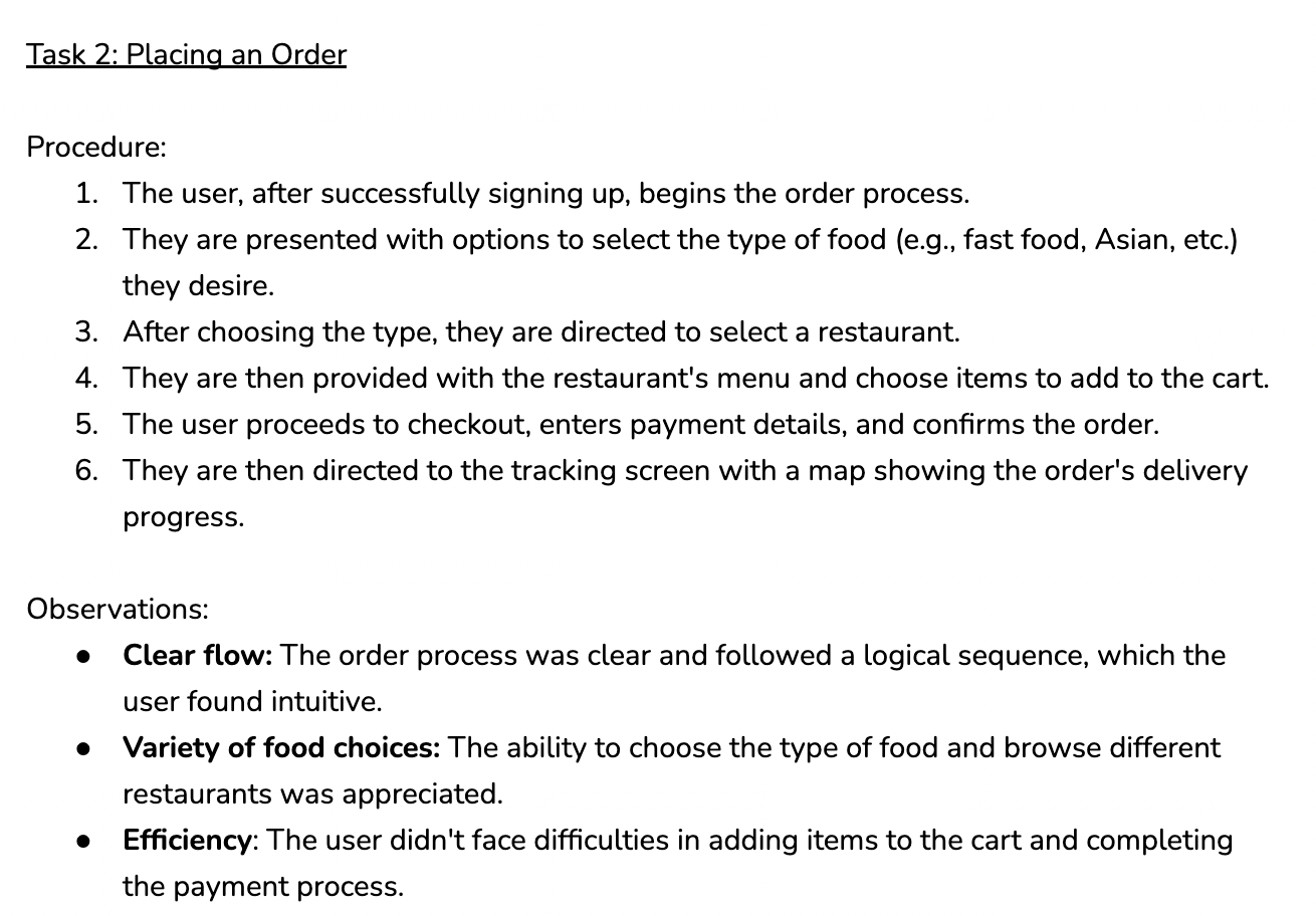
Cognitive Walkthrough
Using the paper prototypes, we conducted a cognitive walkthrough of two essential tasks from our paper prototypes: signing up and placing an order. The documentation is shown below:
Areas of improvement
Integration of information
Streamline the sign-up process by integrating dietary restrictions and favorite foods into the initial personal information form. This would prevent the user from repeating information.
Visual cues
Consider adding visual cues or icons for different food types to make it even more accessible and user-friendly for elderly users.
User feedback
Implement a mechanism to provide users with feedback on their dietary restrictions, suggesting suitable options from available menus.
Personalization
Leverage the dietary and food preferences collected during sign-up to offer personalized food recommendations for the user.
In conclusion, the cognitive walkthrough of our paper prototypes highlighted the strengths of a clear order process and user concerns regarding the sign-up process. Based on the feedback from this stage, we constructed our first iteration of our high-fidelity prototype.
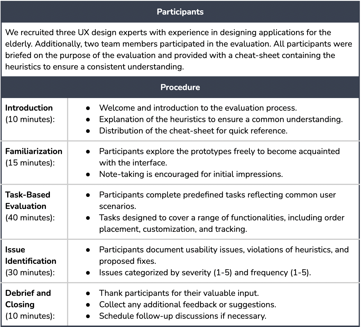
After completing the first iteration of our high-fidelity prototype, we conducted a heuristic evaluation. The following table outlines the study design and results documentation.
Prototype Improvement
The following table outlines the changes made to the high-fidelity prototypes of our food delivery app for the elderly based on the insights gathered from the heuristic evaluation.
Our final version of our high-fidelity prototype follows from the implementation of the results from the heuristic evaluation. They include various features that cater specifically to our target user group: people above the age of 60. Here are some of the overall features we decided to keep in mind while designing:
- Large text, images, and buttons for more readability and visibility
- Use of high contrast colours (black and white) to ensure visibility
- Text-to-speech and dictation buttons on each screen
- Keeping layouts simple, avoiding visual clutter
The more specific features are outlined beside the mobile screens shown below.
Note: the screens below do not encompass the entire flow; some screens have been omitted for brevity. Only the screens that highlight a special feature have been included below. To see the entire user flow, check out the
prototype.


The desktop prototype includes the same features highlighted above, just formatted to be more easily used in desktop format. Here are a few ways the desktop prototype differs from mobile:
- Left side menu instead of the bottom navigation bar in mobile
- Larger images and cards – more emphasis on visual communication
- Less total number of screens, and more information included in each screen
- The existence of hover states
Although the desktop version allowed for more to be included in a single screen, we still wanted to keep clutter avoidance in mind and find proper balance between simple usability and visual clarity.
Below are some examples of what the desktop screens look like. Like with the mobile screens above, not all screens have been included. The full desktop prototype can be viewed
here.
.png)
The table below displays our functional requirements list, and whether or not we were able to fulfill each requirement.
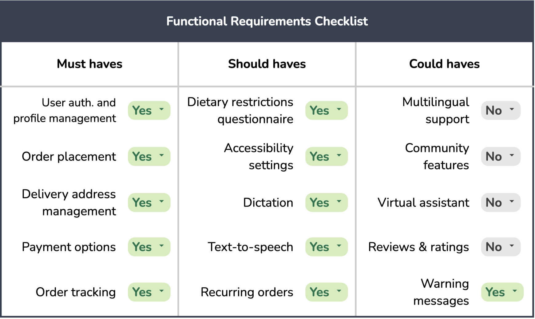
While the “must haves” are functionalities that are required to be there for any food delivery app to work, the “should haves” focus more on catering to our elderly user group. The “could haves” were more optional features that would enhance our app, but we were not able to include them due to time constraints. If we were to continue developing the app, we would aim to implement those features in the future.
The summative evaluation aimed to assess the final prototypes presented in the previous sections. The evaluation incorporated a combination of usability testing, task completion analysis, and user feedback. The study design and results documentation are shown below:
Next Steps
Implementing "Could have" features
Implementing these features would enhance the user experience, and more holistically target our original goals (i.e. the virtual assistant), providing further accommodations for our user group.
Implement feedback from summative eval
Unfortunately, we did not have time to implement the results of the summative evaluation. If we got around to it, this would enhance the more nuanced aspects of the user exeperience.
Continue to conduct tests
After adding the "Could have" features, we would continue to conduct tests with a variety of participants. Since design is a continuous process, there will always be more to improve.
Key Takeaways
Designing for accessibility
Due to the nature of our user group, I obviously had to prioritize accessibility features. For each pain point that elderly users experience, I had to really think outside of the box to come up with a suitable app feature that addresses it, then combining it with everything else to make one cohesive and intuitive experience for them.
Desktop adaptation of mobile interface
This was my first time creating a desktop view based on an originally mobile interface, so I had to think more critically about what advantages and disadvantages a desktop view brings in comparison to a mobile view, and work around these specific aspects.